A method to generate elegantly curved polygon label text for digital maps
In this post, I develop a generalized method to place a label over polygonal geographic features such as lakes and glaciers. It involves creating a medial axis representing the visual center of the polygon that's smoothed with a series of B-splines to produce a line for a label.
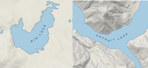
One of my favorite details of hand drawn maps is the way that labels for lakes and glaciers will curve and bend to fill the underlying feature. It’s not common to see this in digital maps. As far as I can tell there’s no easy way to get labels like this with open source GIS tools, so I decided to try to figure out how to make them myself.
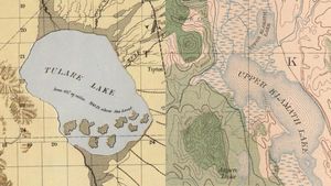
This a visual design problem that must be solved with a generalized computational approach. There’s no “right answer” for how to solve it because the visual results I’m looking for are subjective. The solution I came to in the end is a hodgepodge of different algorithms strung together in a way that I think gives a nice looking result across a wide variety of polygon examples. Here’s the approach I took.
Finding a centerline
The first attribute that stood out to me is how these labels appear to follow the general direction of the underlying feature. If there are major bends in the shape of the feature, the label follows. Assume that in order to have a label we first need to draw a line on which to place it. The line that follows the general direction of the shape might be described as: the longest line that can be drawn through the polygon that’s as far from all sides as possible.
A set of lines that have this quality are called the medial axis of the polygon. The medial axis is the set of lines that are equidistant from the nearest edges of the polygon. I couldn’t find much on how to calculate the exact medial axis, but it can be approxmiated through skeletonization by creating a voronoi diagram from the vertices of the polygon.
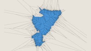
The process for creating the skeleton I used is described in more detail in this excellent Stack Overflow answer. I trimmed the diagram to the polygon, leaving only the lines on the interior of the shape. At this point the medial axis becomes more apparent.
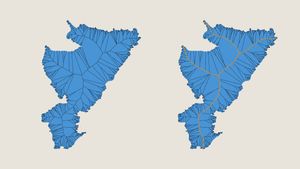
How can we extract the longest axis from the skeleton? If we think about the skeleton as a graph, the points where each line meet are nodes and the lines spanning between are edges. The longest axis is the longest path through the graph; the longest non-branching, continuous collection of edges.
I built a graph using networkx, then found the longest path through a depth-first search of the graph; starting at the center and recursively exploring each branch and building up by choosing the branch with the longest length.
Estimating visual weight
After examining a variety of cases, I felt the longest line through the graph wasn’t always right visually. In shapes such as reservoirs with long branching arms, the longest line would follow one of these long branches rather than staying with the visual bulk of the polygon. I needed to find a way to estimate a path through the graph that followed this visual weight.
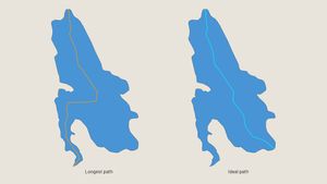
I modified my depth-first search to account for the “weight” of each branch. For each branch the algorithm traverses, it recursively adds all the child branches’ lengths to get the total weight of that branch. Instead of selecting the longest branch at each juncture, the algorithm selects the heaviest branch; the branch with the largest combined length of all sub-branches.
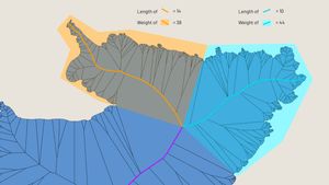
This created what I called the weighted medial axis. However, using these axes as the lines on which to place the labels did not yield a nice result. The axes contained lots of internal bends even through wider sections of the polygons, creating illegible labels. I needed to find a way to smooth the axes out.
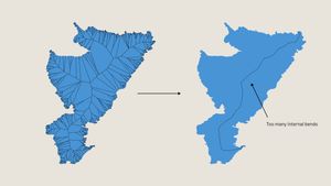
Smoothing the line
This appeared to be a good application for B-splines, which allow for smooth interpolation between a set of points. I used scipy to work with B-splines. My initial tests using B-splines to smooth worked well for conditions where the medial axis was sufficiently far from the edge of the polygon, but not when the axis was closer. In these close situations the B-spline would exit the bounds of the polygon, since the line became over-smoothed and no longer a good approximation of the center of the polygon.
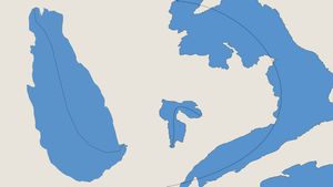
To address this, I split the axis into subsections. Sections of the line sufficiently far from the edge of the polygon would get smoothed with a B-Spline, while subsections closer to the edge would get smoothed with alternative methods. I created these subsections by iterating over the vertecies of the axis and drawing a fixed-length line perpendicular to the axis. If the line intersected with the polygon's edge, the vertex would get added to a subsection to be maintained. Otherwise, the vertex would be be added to a subsection to be smoothed with a B-spline.
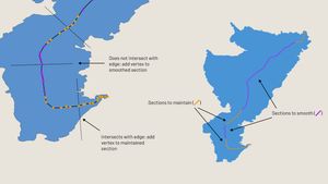
Then I joined the smoothed sections with the original sections and ran Chaikin’s smoothing algorithm over the entire line to knock down any harsh corners.
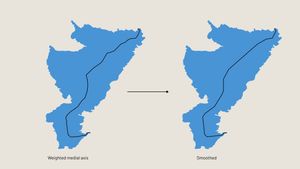
This combination of smoothing methods resulted in lines that were both precise where necessary in narrow regions, and broad in more open regions of the polygon.
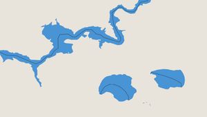
Here’s how the lines look with labels placed over wider polygons, in this case lakes:
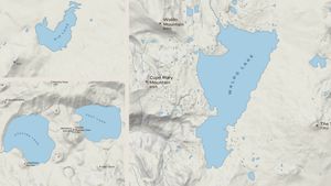
And for more narrow polygons, also lakes:
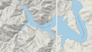
This will not be the final version of this label-placement algorithm; there’s more work to be done to further smooth the lines and handle additional edge cases. For now, though, I think these labels will work nicely.
The repository for this project can be found on GitHub. Feel free to give it a try.
⁂